
The opportunity
Our research team regularly needed realistic app experiences to test new ideas, but we didn’t have one complete prototype of the mobile app. Each study meant rebuilding a limited journey in Figma. That took time, and participants could only follow the paths I had connected in advance.
I saw a chance to build something more useful: a reusable, website-based version of the Appleseed Investments app that could support richer studies and be ready whenever the team needed it.
Establishing design goals
- G1 Give research participants a realistic app they can explore freely
- G2 Stop rebuilding the same journeys in Figma for every study
- G3 Keep one shared, up-to-date experience for design, research, and product partners
My role
As lead designer, I guided the design iterations and partnered with UX Research, product owners, my manager, and the broader design team. I had already designed the production app screens in Figma, so I understood both the visual system and the reasoning behind each experience.
Building it with AI agents
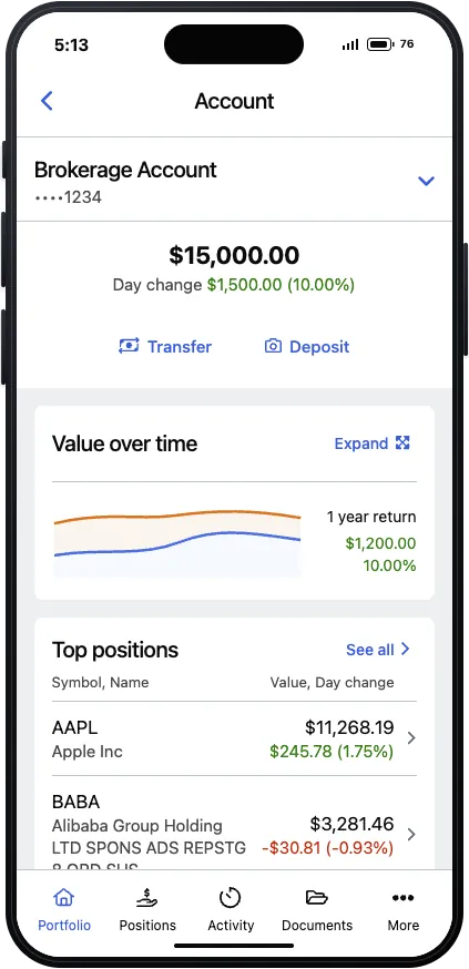
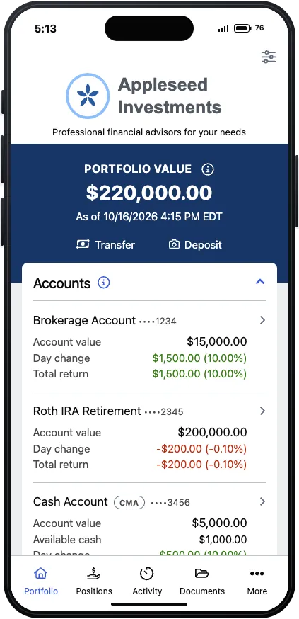
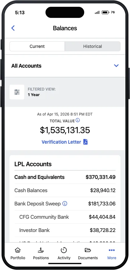
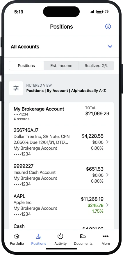
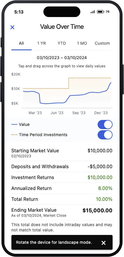
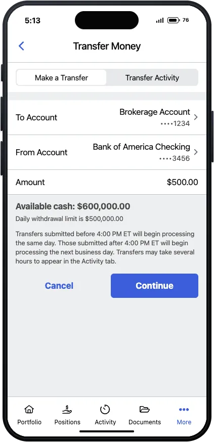
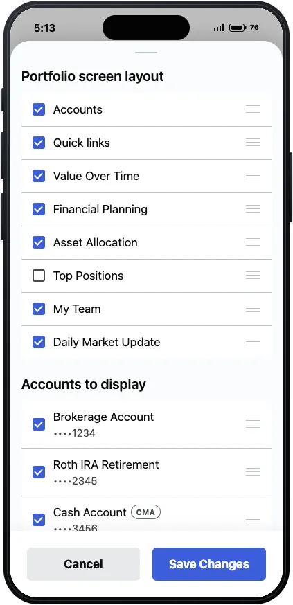
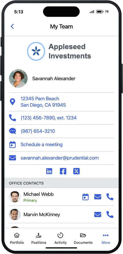
I started by sharing Figma screenshots with AI agents in Cursor and asking them to recreate the experience. Using Claude, GPT, and Composer models, I worked through the app one journey at a time: portfolio, account details, transfers, mobile check deposit, documents, settings, security, and more. In about a week, it grew into roughly 60 connected screens.
Unlike a typical click-through prototype, every screen is a real web page. The testing platform can record each participant’s path, and people are free to explore instead of following one set route.
Designing and learning at the same time
I didn’t build the prototype in isolation. While creating it, I was also running UserTesting studies to validate individual components and compare design directions: 47 sessions across four studies. Each one ended with its own presentation website for stakeholders.
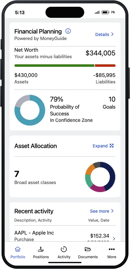
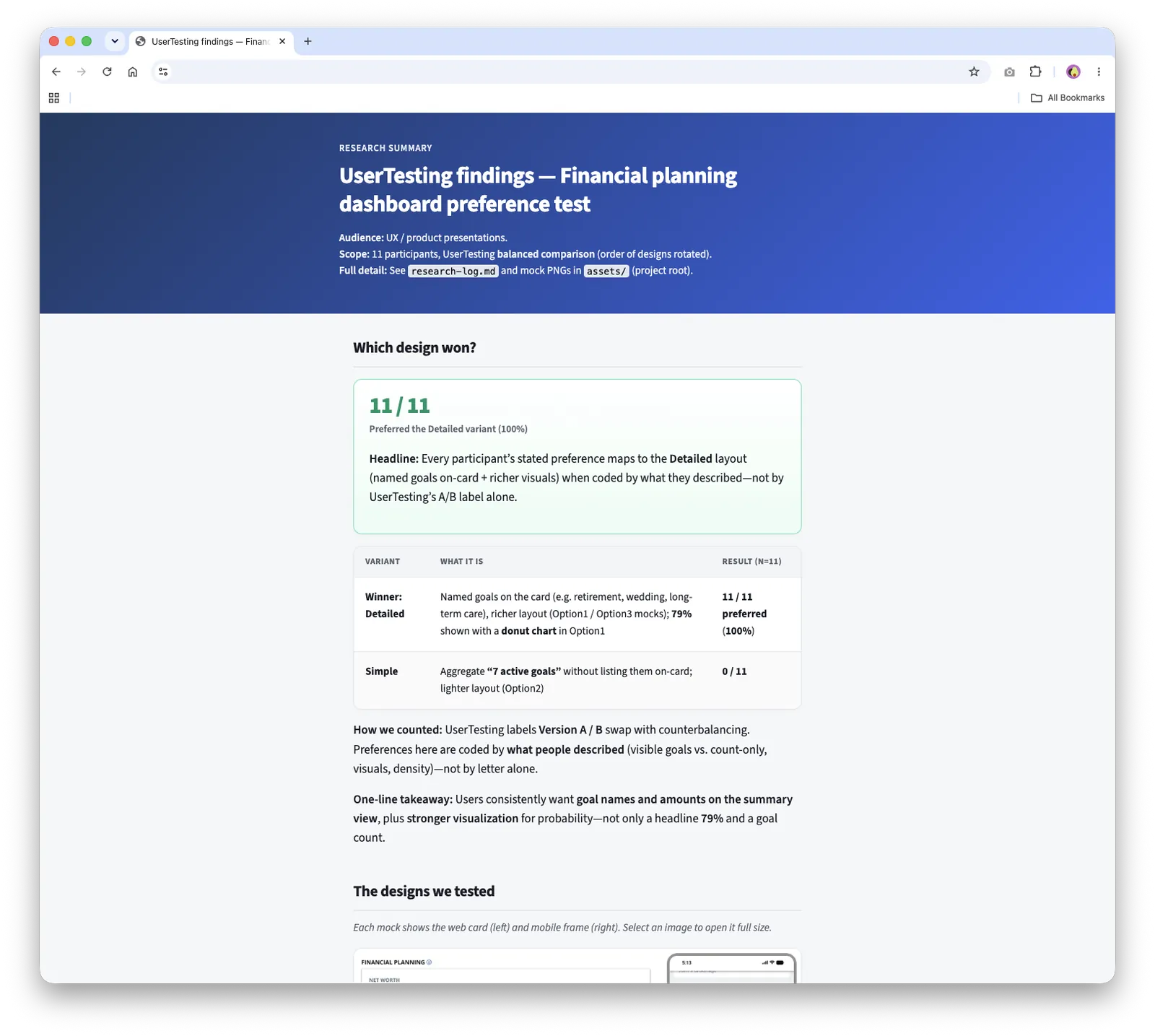
Financial planning dashboard
All 11 sessions favored the more detailed direction, with visible goal names, amounts, and supporting visuals.
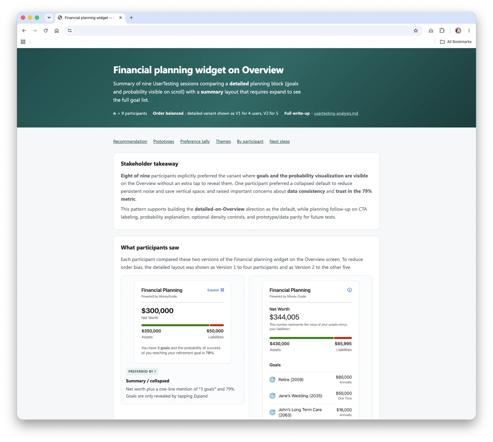
Financial planning widget
8 of 9 sessions preferred seeing goals and probability information right on the overview, without an extra tap to reveal them.
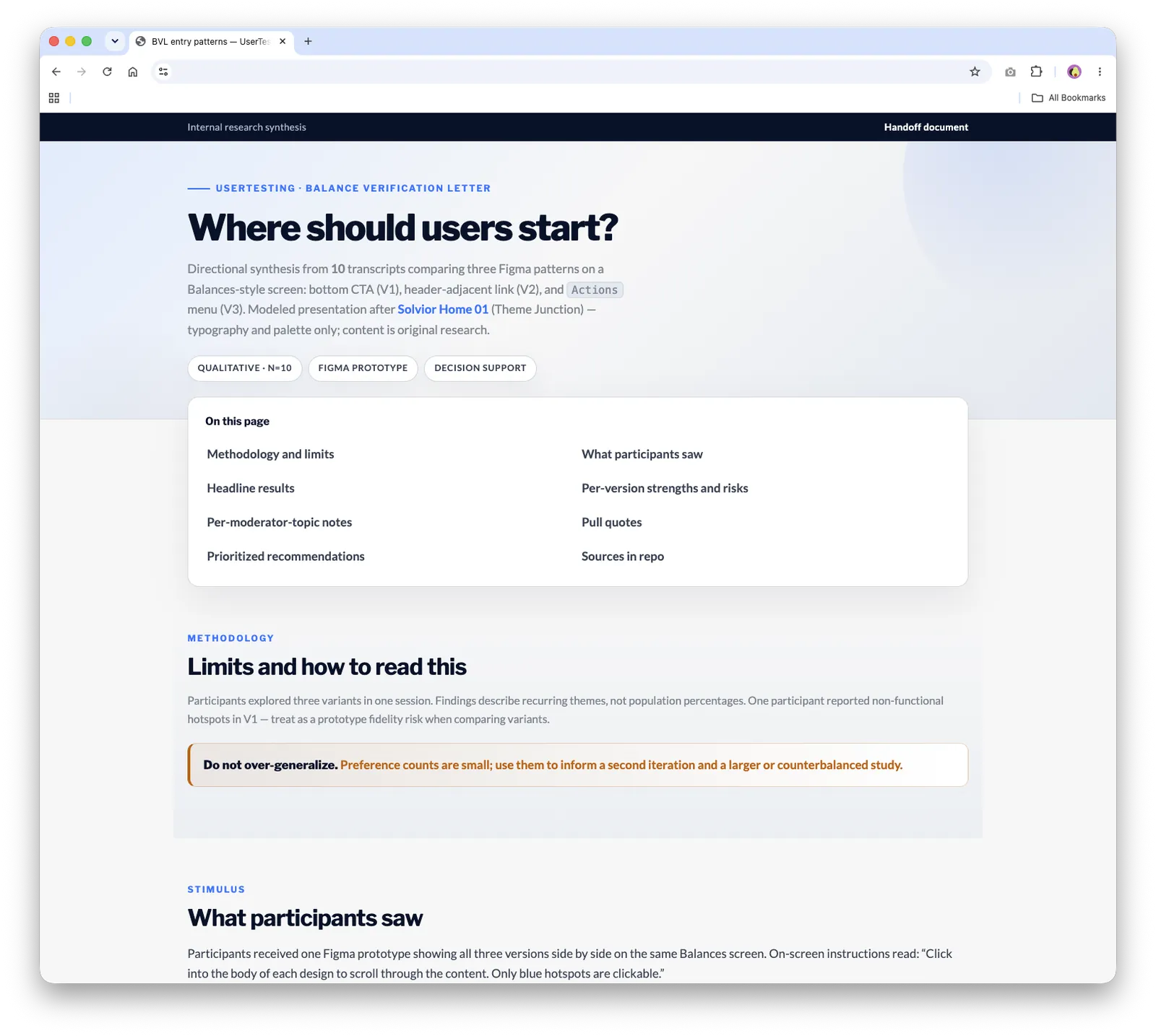
Balance verification letter
I compared three ways to start the task. Roughly 7 of 10 sessions favored the more discoverable link near the top of the balances screen.
General app experience
17 sessions across two prototype versions helped identify a “best of both” direction: clearer portfolio information, more discoverable home customization, and visible account actions.
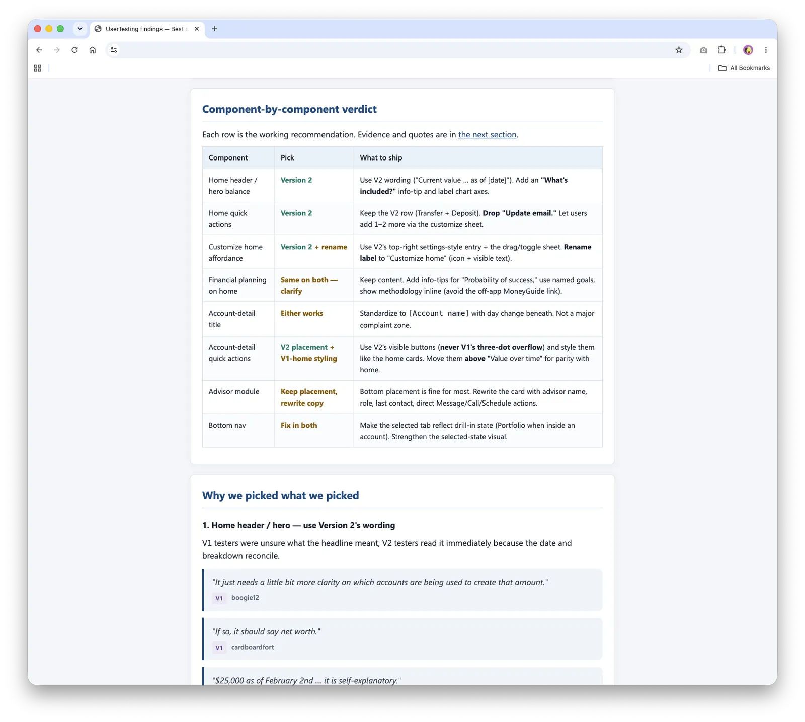
These were directional studies, not statistical proof, but they gave the team concrete evidence for the next iteration.
Learning to ask better questions
One of the biggest challenges was writing neutral questions that didn’t lead participants toward a preferred answer. AI helped me review scripts, remove bias, and write clearer prompts, while the research team made sure each study would produce useful feedback.
Behind the scenes
After each study, I downloaded the results and brought them into Cursor. AI agents helped me organize transcripts, find recurring themes, compare responses, and surface quotes. I then turned the findings into a presentation website for each study.
That created an end-to-end workflow: design in Figma, build in Cursor, test in UserTesting, synthesize with AI, and share the results as a website. The most surprising part was that the same tool that built the prototype could also support research synthesis and communication.
AI sped up the work, but it didn’t replace design judgment. I reviewed every output, refined the experience, and made small CSS changes by hand when that was faster and more token-efficient. I also learned that clear prompts, with context, constraints, and the outcome I wanted, produced stronger work in fewer rounds.
Outcome and what’s next
The prototype is now a reusable foundation for testing ideas in a realistic setting. Feedback from the studies shaped components that have since been handed off for production. It also gives design, research, and product partners one shared experience to review together.
It’s a living tool. Next, I’m adding more detail to the cash management account (CMA) experience and refreshing the financial planning screen, so the team can demonstrate, discuss, and test new ideas at a moment’s notice.
Explore the live work
These are the working prototypes and research sites from this project. Each one opens in a new tab.