

Overview
This project focused on a deceptively complex question: how do major financial institutions organize their digital experiences, and what can we learn from them?
As lead designer, I used Cursor and Composer 2.5 to turn a broad research request into an interactive internal presentation site within several days. It combined competitive research, information architecture analysis, and four grayscale dashboard concepts for comparing ways to organize banking, investing, retirement, insurance, goals, activity, and planning in one customer experience.
The challenge
The project started as a request to support the design team with industry research. We wanted to understand how financial peers structure their websites and signed-in dashboards, especially navigation, account organization, and product discovery.
The audience was my manager, the design team, and internal partners interested in information architecture. The challenge wasn’t just collecting examples. It was turning a large amount of visual research into something organized, readable, and useful for design discussions.
Establishing design goals
- G1 Show how leading financial institutions structure navigation and dashboards
- G2 Organize a large amount of visual research so it’s easy to scan
- G3 Give the team concrete layouts to compare and discuss
My role
I led the project from start to finish. I defined what to research, guided Cursor with detailed prompts, reviewed what it produced, and shaped the design as the work progressed. Rather than treating AI as a one-click solution, I used it as a design partner: clear instructions, project context, careful review, and small manual edits where that was faster or more cost-effective than another round.
Gathering the research
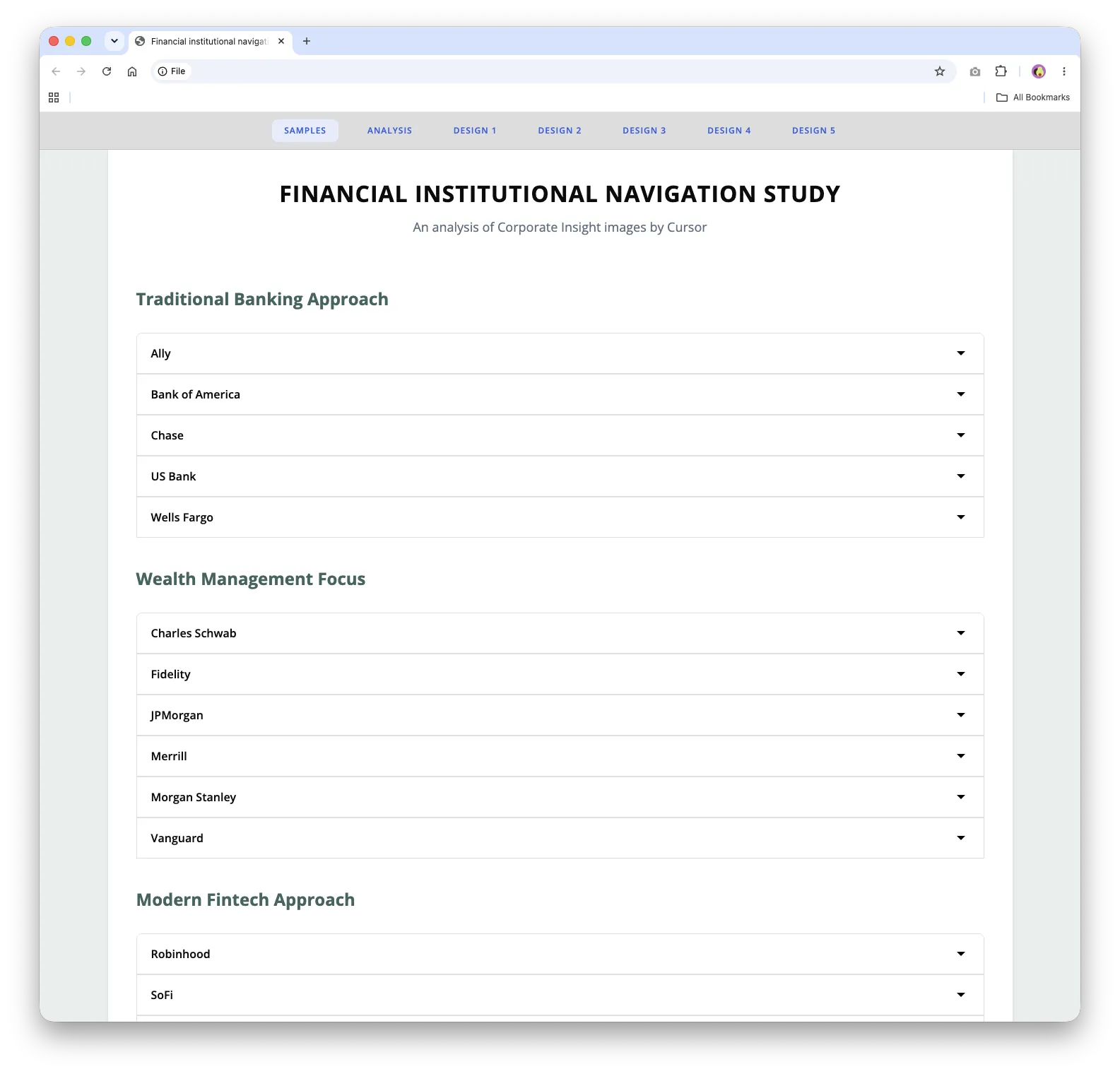
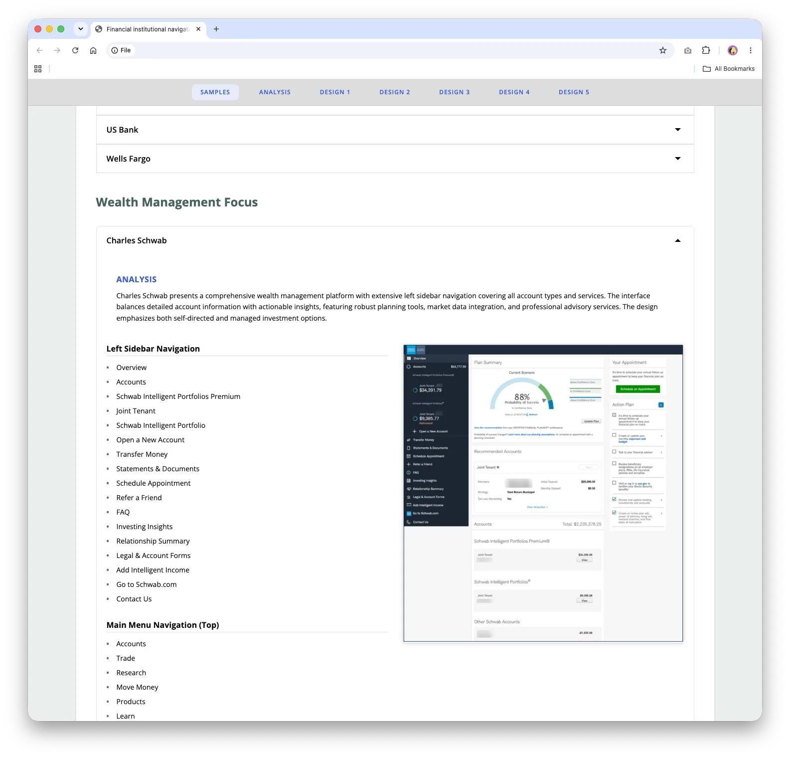
The work started with collecting visual examples from major financial institutions. This was the hardest part, because the AI could only be as useful as the source material I gave it. I had to find relevant images, keep them organized, and give Cursor enough context to analyze them efficiently.
Composer 2.5 then helped scan the examples, identify patterns, and summarize what it found. The study grew to cover 18 institutions, including traditional banks, wealth management firms, robo-advisors, and modern fintech platforms.
Finding the patterns
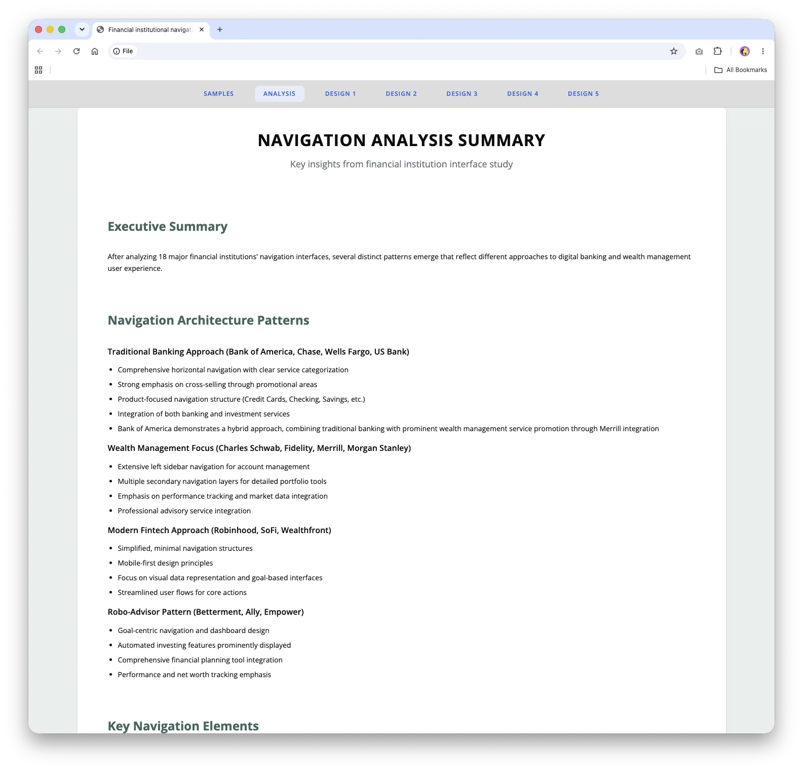
A navigation analysis summary pulled the findings together into four approaches:
- Traditional banking (such as Bank of America and Chase): broad horizontal navigation organized by product, with a strong emphasis on cross-selling.
- Wealth management (such as Charles Schwab and Fidelity): extensive left sidebars and several layers of portfolio tools.
- Modern fintech (such as Robinhood and SoFi): simple, mobile-first navigation with visual data and goal-based features.
- Robo-advisors (such as Betterment and Empower): goal-centered dashboards with planning tools and net worth tracking.
Four dashboard concepts
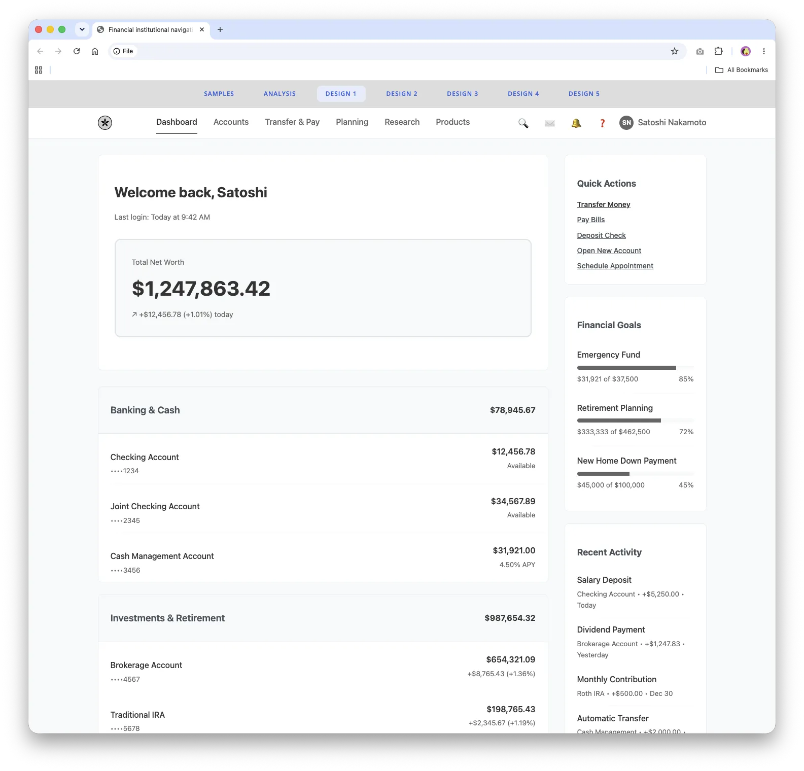
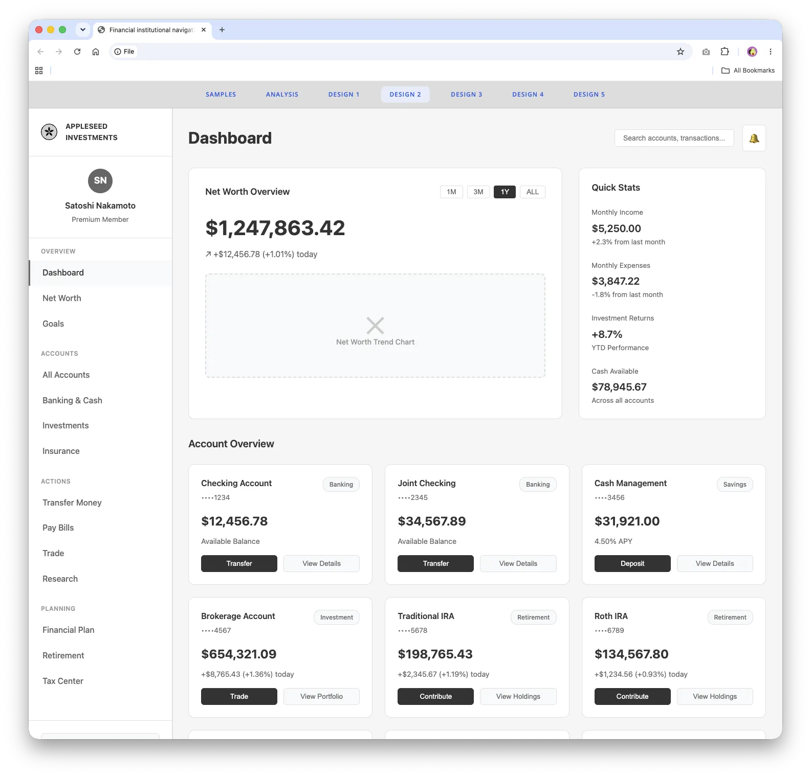
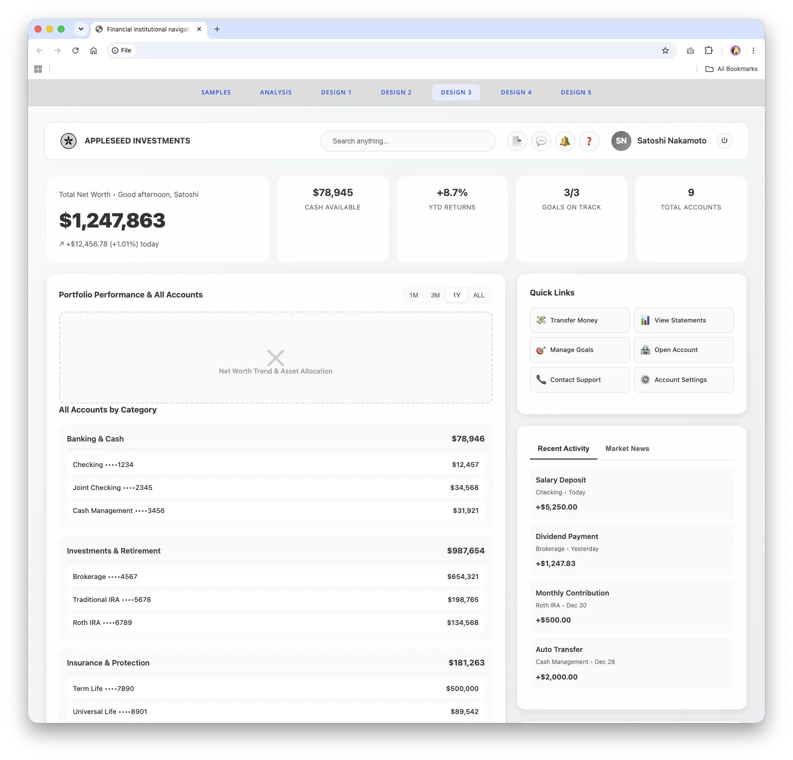
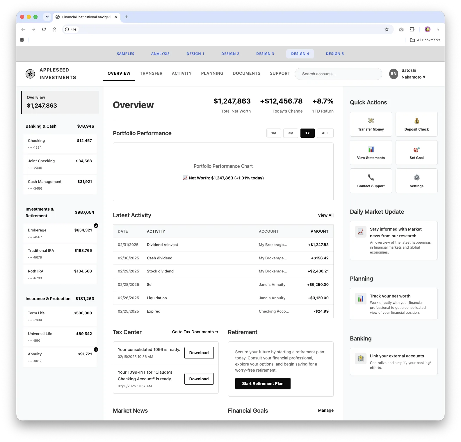
Next, I guided Cursor to build four dashboard concepts for Appleseed Investments. Each one uses the same customer profile and financial data, so the layouts can be compared fairly. Keeping them grayscale kept the conversation focused on structure instead of color and branding.
Behind the scenes
One of the most interesting parts was how quickly the AI moved from raw visual references to structured design insight. Once I had organized the screenshots and given clear direction, Cursor could summarize navigation patterns, spot common interface choices, and turn the findings into a presentation-style website.
I also learned where my own design judgment mattered most. I reviewed the output closely and made small CSS edits myself when that was the fastest path, which saved tokens and kept the project moving. The workflow became a practical balance: the AI handled repetitive analysis and production, and I stepped in for refinements, quality checks, and design direction.
It also freed up my time. While the research site came together, I kept supporting Figma work for the app development team.
Outcome
Within several days, a research request became a working internal presentation site. It documented competitive findings, summarized patterns across financial institutions, and gave stakeholders four low-fidelity concepts to compare as they discussed what might work best for a scalable financial services experience.
What I learned
This project reinforced the value of well-crafted prompts. The clearer I was about the goal, audience, structure, and constraints, the better the results, with less back-and-forth and fewer tokens used.
It also showed that AI agents are especially useful for projects with lots of content organization, pattern recognition, and repetitive production. The designer still leads the direction, judges quality, and makes the decisions, but the agent can dramatically shorten the path from research material to a usable result.
What’s next
In a future round, I’d add updated visuals from more sources, keep tracking how financial UX trends change, and use the prototype as a foundation for deeper stakeholder review and refinement.
Explore the live work
These are the working prototypes and research sites from this project. Each one opens in a new tab.