
The project
Horizon is an in-progress client mobile experience for LPL Financial. It explores how investments, money movement, goals, banking, cards, research, advisor service, and AI assistance could come together in one app. I support the lead designer on this large, fast-moving effort.
The pace makes it unusual. Designers are exploring user journeys, stakeholders are discussing priorities, and the Decimal design system team is defining how the company’s web design language should work on iOS and Android, all at the same time. Instead of waiting for every decision to settle, I keep a central version of Horizon current with what the team learns in meetings. Managers, designers, product owners, developers, and stakeholders all use it as a shared reference point.
Establishing design goals
- G1 Give the whole team one shared, up-to-date version of Horizon to react to
- G2 Turn abstract product-scope discussions into something people can see and click
- G3 Explore how an advisor’s brand can appear without hurting usability
My role
I support the lead designer by maintaining the working Horizon prototype. I turn ideas from meetings and my teammates’ contributions into one central experience everyone can review, and I use AI agents in Cursor to turn new information into visual options the team can react to quickly.
Designing for different clients
One important question was how Horizon should change for clients with different financial needs. Product scope is hard to discuss as a feature list, so I used agents in Cursor to prototype three client roles:
- Basic focuses on two investment accounts, performance, positions, documents, tax information, contacting the advisor, and educational help.
- Typical adds money movement, mobile check deposit, research, and the Cyan AI assistant.
- Advanced represents the full concept, with net worth, goals, banking, cash, cards, research, and AI assistance.
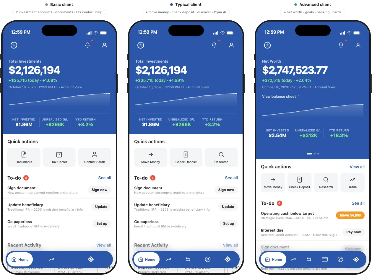
A comparison launcher shows the roles side by side. Stakeholders can see how navigation, information density, and available actions change, instead of trying to imagine those differences from a requirements list.
Exploring white-label Home designs
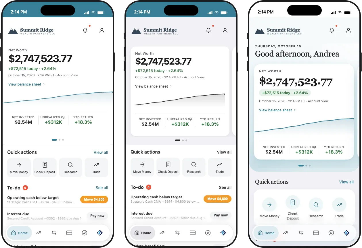
I also used Cursor to create three alternative Home screen directions for the design team, based on the Advanced experience. Each one applies an advisor’s logo and brand color in a different way: a clean white layout, a card on gray, and an airy gradient. Reviewers can switch between advisor colors and logo shapes to see how each design holds up.
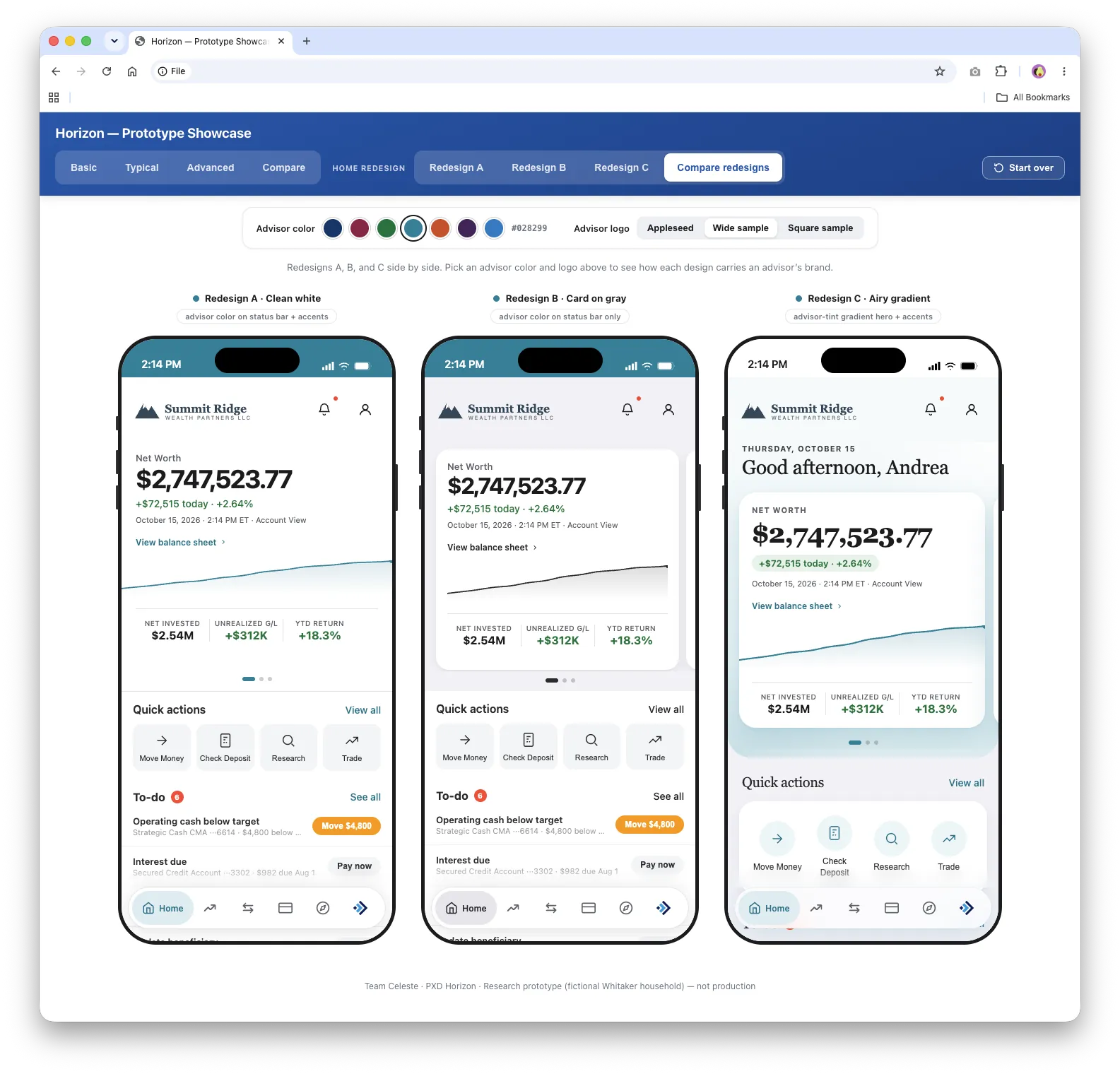
These aren’t final designs. They’re conversation tools that help the team discuss white-labeling, hierarchy, visual tone, and the balance between brand expression and usability.
How I work with AI agents
I use Claude, GPT, and Composer models in Cursor, choosing the model based on the task. I treat the agents like collaborators who need a clear brief, not tools that produce a finished answer from a vague request.
My prompts describe the audience, the product goal, the exact files involved, the behavior to keep, what must stay untouched, and how we’ll know the work succeeded. That level of detail gets better results in fewer rounds, which saves both time and cost. Agents are great at tracing connected behavior, generating consistent variations, checking repeated patterns, and keeping documentation current. I review every output against the design intent, and I make small CSS changes myself when that’s faster and more token-efficient.
Behind the scenes
The prototype is intentionally simple. Each version is a single, self-contained HTML file with its styles, interactions, and demo data together, and no build process. It uses a fictional household, advisor, and account history, so the team can demonstrate realistic financial scenarios without any client information. That keeps the files portable, but it also means every change has to be coordinated carefully across thousands of lines of connected code.
Not every experiment makes the cut. We tried two ways of applying the Decimal design system directly to Horizon. They taught us a lot about tokens, components, and the gap between web and native mobile patterns, and we retired them when they no longer served the current review. Treating them as experiments, not failures, helped clarify the next step.
A mobile design system concept
In parallel, I created an online concept of a mobile Decimal design system to help the Decimal team picture how iOS and Android components could look in the company’s existing design language. The iOS version follows Apple’s Human Interface Guidelines and documents 54 components and patterns, each with a spec table and an interactive demo, in both light and dark modes.
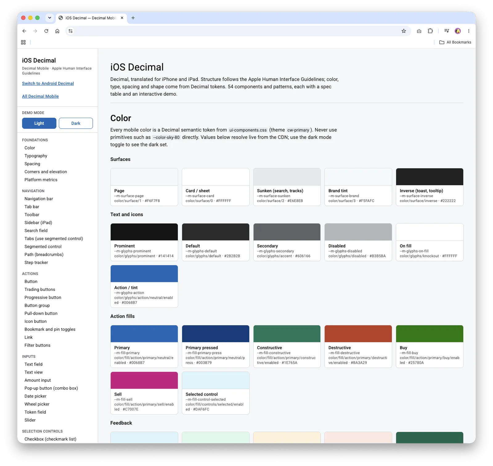
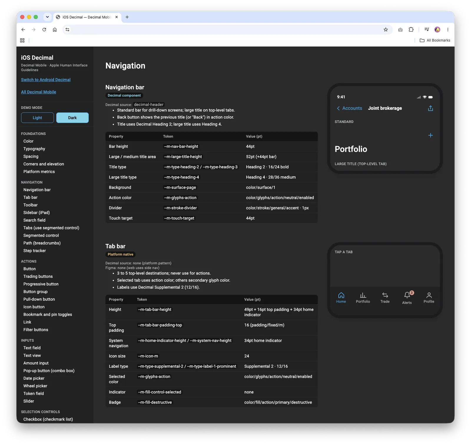
As the Decimal team settles on its mobile styling, I plan to update the concept and bring the agreed system into Horizon.
What I’m learning
There are no final metrics yet because the work is ongoing, but the prototype is helping the team stay aligned under a demanding deadline. The most surprising result has been how well the team can work independently and together at the same time: everyone keeps developing their own area, and the prototype gives us a common place to reconnect.
My biggest lesson is that good AI-assisted design is less about asking for a finished answer and more about giving agents strong context, setting clear boundaries, reviewing their work, and knowing when a quick manual edit is the better choice.
What’s next
I’ll keep adjusting the role-based experiences as requirements evolve, create new design options in response to partner feedback, and connect Horizon more closely to the emerging mobile Decimal system.
Explore the live work
These are the working prototypes and research sites from this project. Each one opens in a new tab.